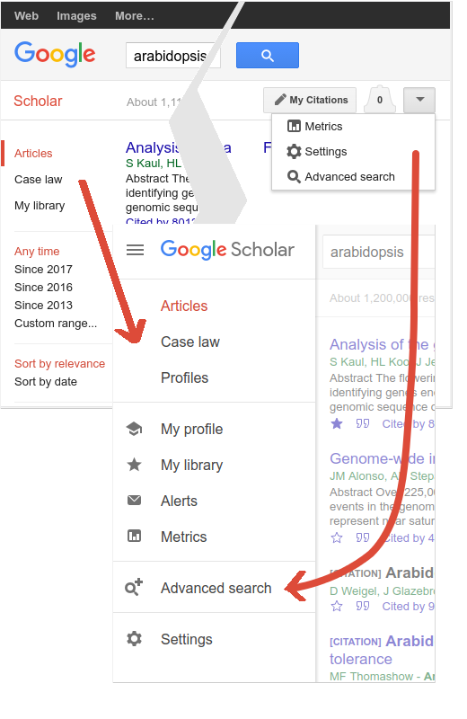
If you thought Google Scholar had about twenty different screens, you'd be half right. We have just made it easier to find your way around them.
Settings, advanced search, case law, and "my library" moved into the side drawer, which is now present on all screen sizes and all devices. If you're wondering how to get to a Scholar feature that you don't immediately see, it's probably in the drawer; click the menu icon in the upper left of the screen to open it.

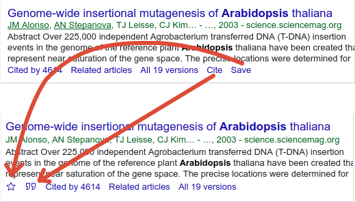
"Cite" and "save" options under each search result moved to the left and became icons. The quote icon shows formatted citations in a variety of styles - MLA, APA, Chicago, Harvard, Vancouver, - and links to export the citation to EndNote and other bibliography managers. The star icon saves the search result to your personal library, so you can read or cite it later. To review your saved articles, open the drawer and click "my library".

Author profile pages got a cleaner look, especially on mobile devices. Rest assured, we did not change your citation counts - at least, not intentionally. It is, however, a good time to review your photo - it's now a circle - and to update your affiliation and research interests. Please visit your profile to review and update it.
Posted by: Alex Verstak, Software Engineer